Design how a user interacts with the experience not only on a small touch screen, but also with limited bandwidth.
Think about larger thumbs, readable fonts, and keep screen clutter to a minimum.
Define primary and secondary personas if possible and design the experience to those audiences.
If an experience is created for everyone, it will resonate with no one.
Set clear primary, secondary and (if need be) tertiary paths for your user.
Experiences with clear intentions will bring the best results
We love shiny things, but keep the basic building blocks in place.
Users on Cisco.com will expect things like blue text to always be clickable.
Lighter, faster pages optimized for mobile will decrease bounce rates, increase SEO and drive engagement.
Big gorgeous images and lush background videos are exciting but keep in mind 47% of users abandon any experience if it’s taking too long to load.*
This is often complex subject matter, lets make it simple for the user.
Do not use surprise functionality or mystery navigation.
Handset, Tablet, Desktop, Large Desktop
For full information view at https://wiki.cisco.com/display/DMSE/Responsive+Grid
Mobile – 320 – 599
Small Tablet – 600 - 767
Tablet – 768 – 1023
Desktop – 1024 - 1279
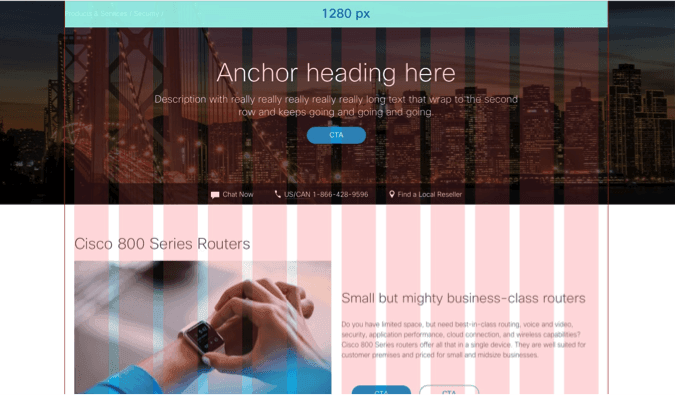
Large Desktop – 1280 - 1600